
|
# 1 -
Posted on 7/12/2015 13:23:23
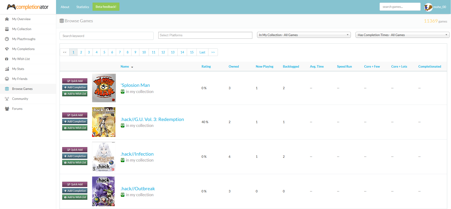
I mentioned this in another thread, but I wanted to shed some additional light on my current development effort. As you may have noticed, we haven't had a new release in a few weeks. That's because I'm currently knee-deep in upgrading the site to the latest version of the Bootstrap CSS framework. The main driver for this is to (eventually) gain much better mobile and tablet support, but there are also some other advantages. The site right now works "okay" on touch devices. Some of the screens are pretty solid, but others are borderline unusable. Although there are a couple of things that don't work because of the older version of Bootstrap I'm currently using, most of it has to do with the way I originally propped up the pages. So I figured if I'm going to try and address this issue, I may as well go all out. That means I'm revamping EVERY page on the site. I was kinda forced to do this since the latest version of Bootstrap is quite different than the one the site is on right now. Since I was going to be going through this process, I decided to re-evaluate my theme options and opted to purchase a new layout for the site. I tried to keep it pretty similar to the current one, but there were a few annoyances I wanted to address. I've never been a big fan of the larger icons on the left menu, mainly because the "sub" menu support is kinda weak (you basically get a little pop up thing). I wanted a menu that could collapse / expand much more naturally. I don't plan on changing up the menu items themselves (same ones, same order), but this provides a lot of flexibility moving forward. Another thing I wanted was to keep the header and side menu fixed, so as you scroll, they're always visible. At this point, I'm about 60% of the way through the upgrade...I think. Many thanks to [cSS]butthouse for helping out on this as well! This upgrade is purely an upgrade, I'm not tweaking layouts (like the shelf view feedback in another thread) or anything. I just want to get us on the new platform so I can get back to addressing feedback you guys have submitted. There's definitely going to need to be some color / spacing tweaks throughout the site, so bear with me when I launch this thing... Speaking of which, as of right now I'm HOPING I can wrap everything up for a release next weekend. I have basically no room for error if I'm going to reach that goal, so we'll see how things go. If not next weekend, it should be the following one. And finally, I wanted to share a screenshot of the new layout to see if you guys have any immediate feedback. This is the Browse Games page:
Post Edited on 7/12/2015 16:23:17
|

|
# 2 -
Posted on 7/12/2015 13:31:49
Link doesn't work, unless that's your not-so-subtle way of telling us in advance that the new site will be broken haha :) |
|
|
# 3 -
Posted on 7/12/2015 16:22:58
Well that's weird! I uploaded it to my AWS account, which is where all of the box art is hosted and marked it as public. Nonetheless, I've uploaded it again to a different location and this one SHOULD work! |
|
|
# 4 -
Posted on 7/13/2015 0:07:16
There we go, looks much cleaner for the side menu layout, I am definitely a fan. I know it's far from a finalized design, but with the new "lighter" scheme you have going on, the various coloured "Add" buttons next to the game kind of stick out like a sore thumb with those solid colours. |

|
# 5 -
Posted on 7/13/2015 20:40:03
Looks great! Keep up the great work! And looking forward to test it on mobile :D |
|
|
# 6 -
Posted on 7/22/2015 0:07:26
I made some great progress on the upgrade this past weekend, but there are still a few pages that need to be fixed. At this point, I'm down to the following:
Aside from those pages, there are a few minor things I want to knock out before the initial release. After that, it should just be optimizing things even further for mobile and cleaning up padding / colors / etc based you the feedback you guys provide :) In general, the site seems to perform much better in lower resolutions, though it won't quite be 100% mobile-ready on day one. But it'll get there! I'm hoping to wrap it up this weekend, but we'll see how things go.
Post Edited on 7/22/2015 0:07:43
|

|
# 7 -
Posted on 7/23/2015 3:07:20
I'm excited for the eventual mobile....I use this site a lot now but I know I'll use it way more if I can get the website to do the right stuff on my phone. |
|
|
# 8 -
Posted on 7/25/2015 13:20:53
Just a quick update here this morning... I've completed the upgrade for 3 of the 4 pages listed above. The only straggler is the Overview page, which I plan to work on next. I would've had it done already, but I ended up fixing a bunch of smaller things along the way and that slowed me down a bit (though it all needed to be done before I can release this sucker). That being said, I plan on rolling the new site out TODAY sometime! I just wanted to give a heads-up in case you guys run into any issues while it's updating. It shouldn't take very long (as in a few seconds), but this is by far the most impactful release we've ever had, so here's your warning :) |
|
|
# 9 -
Posted on 7/25/2015 17:54:01
The new layout is LIVE! There are definitely some quirks and issues that need to be addressed in the next release, but everything should be functional at this point. Like I said before, this version isn't 100% mobile-ready, but it should be a step in the right direction and provides the framework to make mobile work really well. I'll try to post the list of things I plan to address in the next release(s) later on, but definitely let me know if you run into any issues or just don't like how something looks now. Oh and if you do happen to use the site on a phone or tablet, let me know what you think of the menu that shows up. I had issues with the one that came with the template, so I had to prop my own up and I was running out of time, so this was a quick 'n dirty menu. That's actually what held up the release and prevented me from getting to other things, such as toning down button colors, fixing buttons on mobile, etc (more on all that later). |
|
|
# 10 -
Posted on 7/26/2015 3:18:13
Checking it out both on pc and my tablet. So far looks and works really well on tablet for the most part. Few things I've run into so far just browsing stuff: Android Tablet (Chrome): PC (Chrome): |
|
|
# 11 -
Posted on 7/27/2015 2:04:30
@dhobo - I'll add those items to my list of things to work on for the next release. With the text / fields overlapping the box art, I thought for sure that was fixed. It works properly on mobile, I must've missed tablet somehow. Here's what I have on my list (some of which is on yours)
Post Edited on 7/27/2015 12:50:42
|
|
|
# 12 -
Posted on 7/28/2015 11:49:52
Didn't look at the site / announcements due to a re-install of my main PC so big surprise. And I like it! Really a good visual clean-up of the site, everything looks a bit fresher and it feels more modern. Tonight I'll give it a swing on my mobile devices (iPad and Nexus 5) and give some feedback about those. Great work! Definitely for some later date but with the new cleaner look the collection page looks a bit overcrowded to me. When loaded almost half the page is filled with bars, buttons and filters: One last minor thing: it's 2015 for quite a while now, so you may change the year at the bottom ;-)
Post Edited on 7/28/2015 11:50:31
|
|
|
# 13 -
Posted on 8/1/2015 1:51:21
I made some fixes in today's release that should help a bit. The main thing is getting the action buttons to work better on lower resolutions. I'm still not completely satisfied with them and I still need to adjust the colors, but hopefully they at least look decent on tablet and mobile now. I modified the pager so it scales down to tablets better, let me know how it looks on your end. Oh and good catch on the copyright in the footer, I didn't even notice it ;) It should be fixed now though. I'm definitely looking to clean up the Collection Search page and you have some great feedback there. I'll try to roll this stuff in with the upcoming shelf view modification. Let me know if you guys have any additional feedback on the new layout! |
|
|
# 14 -
Posted on 8/2/2015 18:52:20
OK, right now typing this on my iPad while the top bar ( about, etc) has stuck somehow in the middle of the page : http://imgur.com/vkpGkG5 . This doesn't always occur but just reporting. First impression: looks good and works alright. I can do everything on my iPad so impressive :) I know and see this is still work in progress so just giving some feedback about things i see. One of the first things I would suggest is folding or reducing the size of the menu bar to the right. It takes a lot of screen space. I often see the use of different font types, sizes and colors : http://m.imgur.com/7o88Uy7 The collection page works but navigating it is hard work. The filters take up the first 2 screens. ( or 1 when in portrait mode http://m.imgur.com/rrnqdpz) The collection view pretty basic still ( http://m.imgur.com/JEmdnNG ) and I would suggest reducing and harmonizing the buttons, more room for the title and image ( reduce top and bottom margins of the image so they 'stack' . Right now they are floating ( if you get what I mean). Also the page buttons at the bottom are not rendered completely, they are missing the lower part. The detail page looks like it is still 'work in progress' with various parts where the layout is still broken. But all in all I like it so far and will definitely start using it on my mobile devices :-)
Post Edited on 8/2/2015 18:53:39
|
|
|
# 15 -
Posted on 8/7/2015 19:30:04
@Marcelloz - Are you using Safari or Chrome on your iPad? I've still been having some issues with Safari, but those are going to be tough to debug since I'm developing on Windows :P When you say menu bar, do you mean the one on the left? If so, I agree, it should be collapsed for tablets, much like it is on mobile. Speaking of which, have you had a chance to look at the menu on mobile? Does it seem to work okay for you? I threw it in at the last minute, so hopefully it at least functions! I've been fighting with the ever-growing list of filters on the Collection page for a while now :P And just FYI, I made it even worse today because I added a new filter (but it's a nice one if you're trying to find short games!) I'm going to try and get them to collapse a little better and if that doesn't work, I might start hiding some once you hit iPad size. It'd be nice to have a button to toggle advanced filters, but that's more of a long-term fix (more on that later). The page buttons being cut-off has been fixed and will go out with this week's release. Regarding the details page, I've made some changes to help clean that page up a bit. Apparently I didn't test it in iPad resolution because it was working much better on mobile. Anyways, that page should be pretty solid at this point, but let me know if you still see anything weird. Now, back to the filters and buttons that are running rampant on the Collection page. I'm planning on overhauling all of that stuff when I do the shelf view tweaks to hopefully reduce a lot of clutter on the page. I have some mockups from @dhobo for the shelf view changes (thanks!) and I do plan on fixing that stuff up very soon. I'll post more about this later, but I will not be able to work on the site for a few weeks after next week. I'm trying to clean up and knock out smaller items so when I pick the site back up, I can have my plate cleared and work on fixing up the Collection page. I want to approach it that way since cleaning it up is going to be a bit of work :P
Post Edited on 8/7/2015 19:31:54
|
|
NovaNapoleon
Posts: 12
Registered: 1/15/2015
|
# 16 -
Posted on 8/9/2015 8:45:19
Love the new look of the site! Looks way better! :) Just wondering if a person's username will still appear on individual game pages even if their profile is set to private?
Post Edited on 8/9/2015 8:45:48
|
|
|
# 17 -
Posted on 8/9/2015 20:12:01
I am using Chrome on my iPad, don't use Safari that often. I indeed mean the menu on the left of the screen. Keep up the great work! |
|
|
# 18 -
Posted on 8/9/2015 23:11:10
@NovaNapoleon - As of right now, usernames are still displayed, even if the profile is marked as private. That's something I've had on my list for a while, so I'll try to knock it out with the next round of small updates next weekend. I think I'm going to add a new checkbox that lets you opt in / out of having your name displayed, if you mark your profile as private. You'll still be displayed everywhere, but the word "Private" will be displayed and will not be hyperlinked to anything. That rule should apply pretty much everywhere on the site, with the exception of the forums, of course :)
Post Edited on 8/9/2015 23:11:41
|
|
NovaNapoleon
Posts: 12
Registered: 1/15/2015
|
# 19 -
Posted on 8/10/2015 0:53:11
Cool! Thanks! :) |
|
|
# 20 -
Posted on 8/10/2015 14:04:54
You guys may have seen this, but I made the filters section even more cluttered the other day by adding the Quick Filters button. Given that the page will be modified soon, I just kinda stuck it on there. I really wanted to be able to quickly filter and I thought that would be a nice (and easy) way to tide us over until I build the option for saving your own filter sets. All that being said, if there's any quick filters you guys would like to see, let me know! |
|
|
# 21 -
Posted on 8/14/2015 22:28:35
@NovaNapoleon - The private option has been added, let me know if you have any issues with it! |